
Nike is the new uniform sponsor of the NBA, and this week they released the new “Statement” jerseys for every NBA team. Marketing gibberish aside, what that really means is this is the third alternate for most teams.
We’ve now had a few days to process what the new jerseys look like for these squads, and it’s time to figure out which teams got a good deal and which are going to look ridiculous next year.
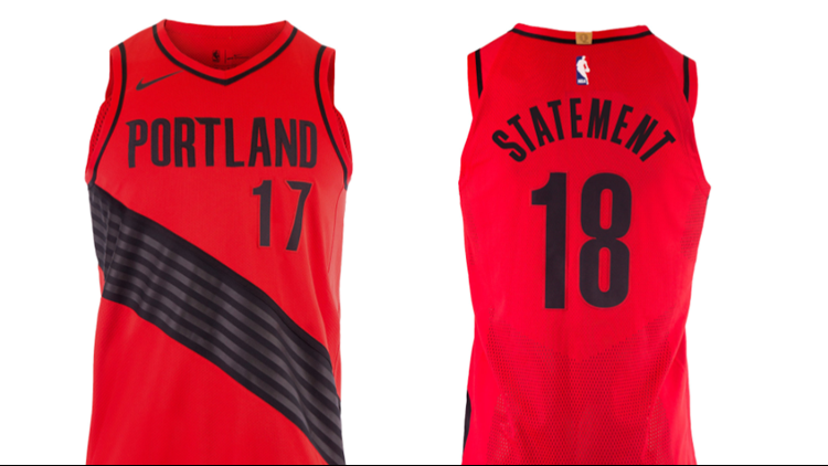
Here's a look at the Portland Trail Blazers' new jerseys.
Rip City Red.
Details » https://t.co/D7WAmSRsG3 pic.twitter.com/F6YYsxTbts
— Trail Blazers (@trailblazers) September 16, 2017Statement.
Learn more » https://t.co/DcJJl2tVDw pic.twitter.com/Au6fZKj9HJ
— Trail Blazers (@trailblazers) September 16, 2017Model Moe.
📸 » https://t.co/aafGv3HiQn pic.twitter.com/vGJMJP9Fpu
— Trail Blazers (@trailblazers) September 16, 2017Yes, it’s time to rank the best Statement jerseys for every NBA team. However, it would be hard to put them in a strict numerical ranking, so instead I’ve decided to put each in one of three different categories.
The first are teams with a patently dope colorway or uniform combination. These are the good ones. The second are the openly awful, which seems to have forsaken a large swath of franchises this season, even after Nike took over for adidas. Finally, we have the boring. These teams sit in the middle of the pack, with no real impact. Some teams also landed there because they didn’t debut new alternates with Nike.
So without further ado, here are how the new Statement jerseys shook out for every NBA team. If you don’t like these, you still have the fourth colorway yet to be released here this year.
The Patently Dope
Boston Celtics: The Celtics went with a cool black and green colorway here instead of going with some of the weirder combinations that were similar to this jersey in years past. Teams either go with too much black or not enough black, and this is just the right amount with some green still on it.
*prepares to lose all followers*
*clears threat nervously*
I like this jersey. pic.twitter.com/VMdy1qaXjf
— Tom Westerholm (@Tom_NBA) September 16, 2017Charlotte Hornets: Look, the Hornets have had a new purple uniform for a few years but just how dope this rebrand has been from top to bottom is enough to put it in this category. Plus, how do you not love a jersey with the Jumpman logo on it?
Kemba cheeeesin' in the @hornets' Statement jersey. pic.twitter.com/0jAMyB2H1W
— SLAM Magazine (@SLAMonline) September 16, 2017
Chicago Bulls: These black joints came back like Jordan wearing the 45.
Tap into the @chicagobulls. https://t.co/quh34aDq2p#NIKExNBA pic.twitter.com/Mj2zvYj4eK
— Nike Chicago (@NikeChicago) September 16, 2017
Denver Nuggets: Let this be a notice to teams with cities whose skylines are not interesting. That is, make the whole thing a scene and not just some squares that nobody outside your market will recognize. This means you with your water stain/skyline floor, Cleveland.
Statement.
📸 | https://t.co/5FHFfLe6LZ pic.twitter.com/r68xTyfYq1
— Denver Nuggets (@nuggets) September 16, 2017Houston Rockets: Just about anything is an improvement for Houston, who have had some of the worst jerseys in the league since the Bobcats turned back into the Hornets. If Portland is any indication, having a black and red jersey will always be timeless.
🔥 STATEMENT JERSEY. 🔥#NIKExNBA pic.twitter.com/bpCpkp3dkb
— Houston Rockets (@HoustonRockets) September 16, 2017
Milwaukee Bucks: This is similar to jersey designs of years past for Milwaukee, but this is just too fresh to dismiss. That black, cream, and forest green colorway is incredible.
Make a STATEMENT. #FearTheDeer
More: https://t.co/a1jvJlFMHw pic.twitter.com/7gk8OaDLHl
— Milwaukee Bucks (@Bucks) September 16, 2017Philadelphia 76ers: Do I even have to explain this one? That script is legit.
The @Nike collection so far...#NIKExNBA » https://t.co/lthv0vkSPa pic.twitter.com/tpDEhBuiO5
— Philadelphia 76ers (@sixers) September 16, 2017
The Boring
Brooklyn Nets: They’re black and white and have letters missing. Not exactly inspiring design work.
B K L Y N. pic.twitter.com/0Iw4yucKKq
— Baller Street (@BallerSt_) September 17, 2017
Cleveland Cavaliers: This one looked better as a concept than it did in person. The number and logo being the same size looks a little awkward, but the nod to the sponsor (and history) in Goodyear is cool.
J.R. Swish wearing the new Statement Edition uniforms! 👀 pic.twitter.com/3esydSUnmz
— Cavaliers Nation (@WeAreCavsNation) September 16, 2017
Golden State Warriors: The tree logo is nice and of course it has its roots in the city. However, it doesn’t really look like it belongs on the front of a jersey. This is a cool t-shirt design.
What do you think of our #NIKExNBA Statement Edition uniforms, #DubNation? 👀 pic.twitter.com/IlmdRCnsPB
— GoldenStateWarriors (@warriors) September 16, 2017
Indiana Pacers: Indiana’s kit here is sort of hard to call but it is at least a move in the right direction for the Pacers, who have had a terrible streak of design missteps over the last two decades.
See more photos of the Statement uniform and pre-reserve your new Pacers jersey at https://t.co/nq0ocBgCTb pic.twitter.com/w44KInw7Fa
— Indiana Pacers (@Pacers) September 16, 2017
Memphis: Abolish the sports bra / shoulder pad thing. It looks weird. This goes for Washington, too.
Mac11 + #NIKExNBA 🔥 pic.twitter.com/B5rd787vDV
— Memphis Grizzlies (@memgrizz) September 16, 2017
Miami Heat: Same ‘ol, same ‘ol. Give me black, orange, and pink already.
New 🔥 #NIKExNBA pic.twitter.com/JytHVmLVhh
— Miami HEAT (@MiamiHEAT) September 16, 2017
LA Lakers: It’s purple.
#NIKExNBA pic.twitter.com/rAQUWLrtAK
— Los Angeles Lakers (@Lakers) September 16, 2017
New Orleans Pelicans: The Pelicans don’t have good colors. They need to go full French Quarter and stop coming up short. This one is also similar to jerseys from years past.
.@IanClark in the new #Pelicans Statement Edition Uniform! #NIKExNBA #DoItBig (via @nikebasketball) pic.twitter.com/flk6W51j7H
— New Orleans Pelicans (@PelicansNBA) September 16, 2017
Toronto Raptors: Repeat. Pretty cool, but again black-and-red really only belongs to one team in this league.
Statement.#WeTheNorth | #NIKExNBA pic.twitter.com/Yamw8iCVpG
— Toronto Raptors (@Raptors) September 16, 2017
Washington Wizards: I know everyone loves these jerseys but I think they are pretty boring. It’s fine, it’s grown on me.
ICYMI: Clean navy returns as the Statement Edition. #NIKExNBA | https://t.co/03wev3Y36P#DCFamily pic.twitter.com/VyAL5mqaK0
— Washington Wizards (@WashWizards) September 16, 2017
The Openly Awful
Atlanta Hawks: Atlanta’s rebrand continues to be hilariously terrible. This is Steve Nash Phoenix Suns bad.
Making a Statement. #NIKExNBA pic.twitter.com/6vw3WMLZta
— Atlanta Hawks (@ATLHawks) September 16, 2017
Dallas Mavericks: The Dallas skyline isn’t nationally recognizable and we have to stop putting city outlines on courts and jerseys. These have a strong Team Blue From A Detergent Commercial vibe to them.
🆕 STATEMENT X SKYLINE@jjbareapr pic.twitter.com/P26L7QsvJA
— Dallas Mavericks (@dallasmavs) September 18, 2017
Detroit Pistons: Have you ever seen something this aggressively gray?
Strong Island in the @DetroitPistons ' Statement jersey. pic.twitter.com/CUk13yzaqq
— SLAM Magazine (@SLAMonline) September 16, 2017
LA Clippers: The Clippers need to go back to their old script immediately.
⚪️ Association
— LA Clippers (@LAClippers) September 17, 2017
⚪️ Icon
🔘 Statement #NIKExNBA » https://t.co/2wt7OsKXxn pic.twitter.com/jjW7TXaV3W
Minnesota Timberwolves: Say it with me: Go Seahawks. Did Minnesota learn nothing from Atlanta rebranding with bright, neon colors? We might have to rethink watching a lot of Timberwolves games this year like we all planned.
Ready to make a Statement. #NIKExNBA #NewEraNewThreads pic.twitter.com/DuaiqtnraN
— Timberwolves (@Timberwolves) September 16, 2017
New York Knicks: For as much as orange and blue is an “uncool” colorway, the Knicks have typically done their uniforms pretty well. This one misses the mark so bad it looks like I designed it.
After a 2nd look I'm actually liking the Knicks new statement jerseys pic.twitter.com/wO9qaqHyQP
— New Era Knicks (@NewEraKnicks) September 16, 2017
Oklahoma City Thunder: These have to be gone after next year right? They are so hilariously bad it really gives Minnesota a run for their money. The schism in the front contrasted with the WordArt-style gradient on the back is a huge clash in design language. Not a great showing for the team who might already have the worst uniforms in the league.
OKC. Big & Bold. Sunset on Navy. Get ready #LoudCity. Here's our 3rd uni for 17-18. Statement Edition. #NikexNBA pic.twitter.com/WSml7UegVT
— OKC THUNDER (@okcthunder) September 16, 2017
Orlando Magic: There are two problems with the Orlando black alternate. First, there aren’t enough stripes on it. Just go back and look at some photos of what these are mimicking from the mid-90s. That’s why these look so weird, they have half the striping. Second, the jerseys are too wide at the shoulder and neck, making them look like a sweater vest. They say black is slimming but weird shoulders and wide set stripes actually make Orlando players look fatter somehow. These have to go, they are so close to getting it right.
The Magic "Statement" jerseys are clean. I see you @elfrid 👀 pic.twitter.com/DX27dh64rQ
— The Lando (@TheLando__) September 16, 2017
Phoenix Suns: Right Click > Blending Options > Bevel & Emboss > Inner Bevel > Chisel Hard > OK.
Eric Bledsoe shows off the black "Statement" jersey for the Suns. pic.twitter.com/CrQUHxUorG
— Phoenix Suns Insider (@InsiderSuns) September 16, 2017
Portland Trail Blazers: It’s pretty hard to find a way to mess up a red and black jersey, but the Blazers did it this year. It’s a double whammy given that Portland took the best alternate jersey in the league from last season and turned it into the worst. This uniform literally has tire tracks on the side of it. Hard pass.
Model Moe.
📸 » https://t.co/aafGv3HiQn pic.twitter.com/vGJMJP9Fpu
— Trail Blazers (@trailblazers) September 16, 2017Sacramento Kings: I am all for the Kings really leaning into their mascot and namesake, but loose weave chainmail isn’t doing it for me here.
Go behind-the-scenes with @BuddyHield and the new Statement Uniforms 🔥 » https://t.co/OYkKTiC8MN pic.twitter.com/j5qqHyvYLI
— Sacramento Kings (@SacramentoKings) September 16, 2017
San Antonio Spurs: Everyone likes to make Boring Spurs jokes but it is time somebody said it: we have to get rid of gray jerseys. They look like someone forgot to design anything. We can’t stand for this in the best sports league on Earth.
Last night, @DejounteMurray joined the @NBA, fellow players and @nikebasketball to make a Statement.
📸 » https://t.co/AljvsQ4tzM pic.twitter.com/K3CHCwBcoe
— San Antonio Spurs (@spurs) September 16, 2017Utah Jazz: Two blues and one purple will forever be the best Utah Jazz color combination. You can’t tell me otherwise. Yellow and green is great, but you can’t stick navy blue in there and expect me not to point to a color wheel, eyebrows up and mouth agape. I’ve got no nostalgia for the old school Jazz colors, they need to ditch ’em ASAP.
All gold. pic.twitter.com/MxZB3Fggpl
— SLAM Magazine (@SLAMonline) September 16, 2017